Planning Blog: Title design
Title Design
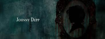
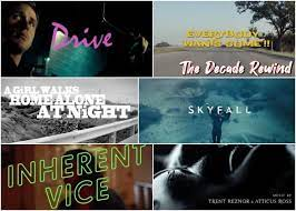
The opening credits to my film will appear as a person is walking horizontally on camera. It will look as if the words are following the person behind them as to fit the plot of a stalker following the main character in my film. They will be in a bolded-italicized white 'Macando' font (Just like this style) to fit the dark setting of the film and will take up the majority of the screen for 3-4 seconds before the scene switches to a girl being followed by a stalker with a camera and notepad. The working title for my film will likely be "Skulker". The credits for my film will most likely appear in a black 'Permanent Marker' font (Just like this) and will appear highlighted on the notepad that the stalker in the film is writing in about the person they are following. They will appear for 2-3 seconds as the stalker is flipping through his notepad. The rest of the notes that the stalker is writing will not be highlighted as to give more attention to the credits of the film. The name of the person who holds the job will be underlined in a red pen. For example, "Directed by: Nila Lewis."


Comments
Post a Comment